A client approached me to design a logo for his e-course focused on reducing anxiety and managing everyday stress. His target audience consists of women aged 20 to 40—many of whom are balancing careers, parenthood, and daily responsibilities on their own. He was seeking a visual identity that felt tangible, fluid, and calming to reflect the course’s supportive and soothing nature.
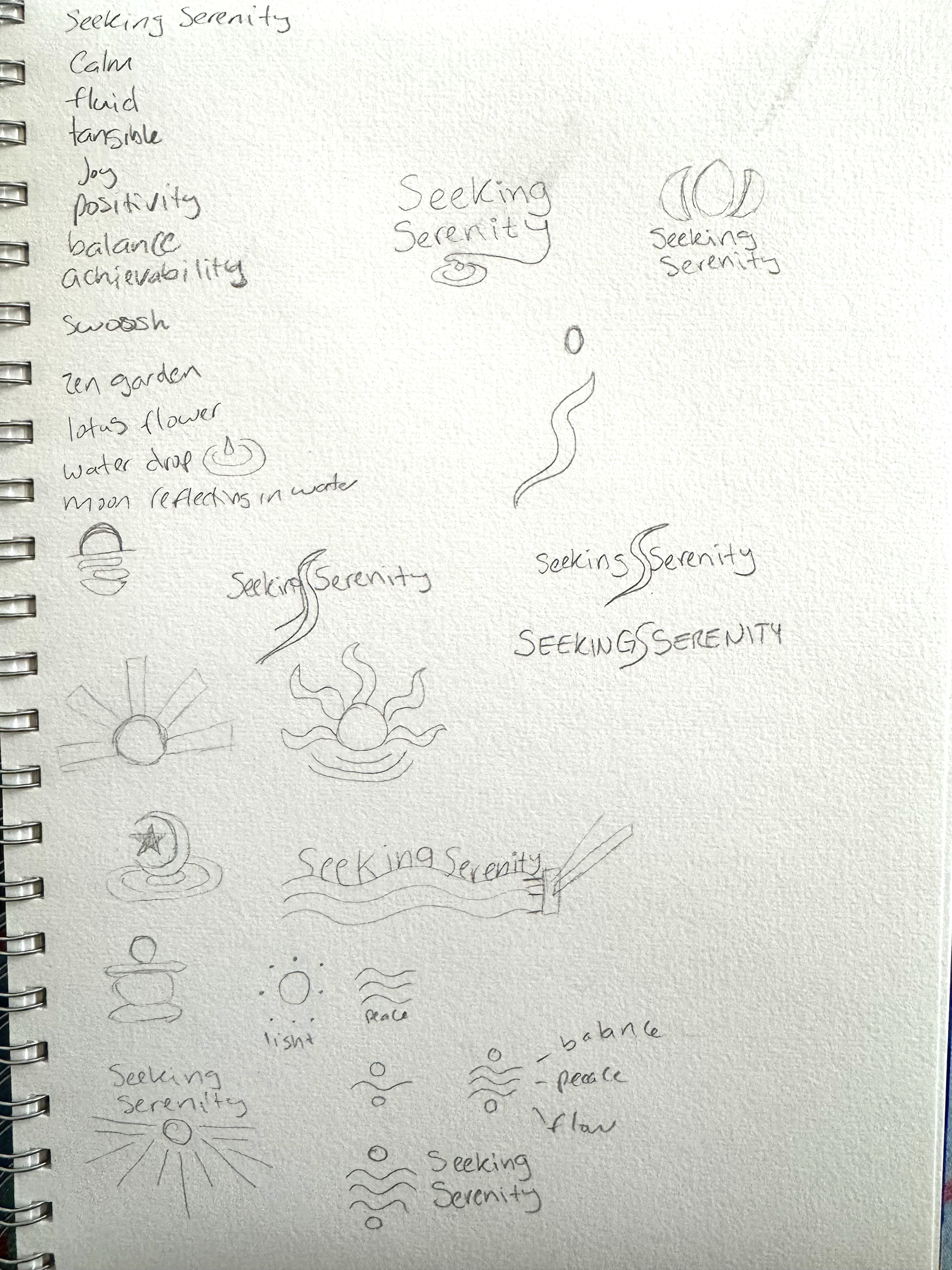
To gain a deeper understanding of the brand and the client’s vision, I asked targeted, strategic questions and compiled a list of keywords that reflected the essence of his business. While the e-course incorporates meditation, I intentionally avoided overused visual clichés—such as lotus flowers or meditating figures—to ensure the logo felt distinctive and authentic. It was essential that the final design not only stood out in a crowded space but also aligned seamlessly with the brand’s purpose and tone.
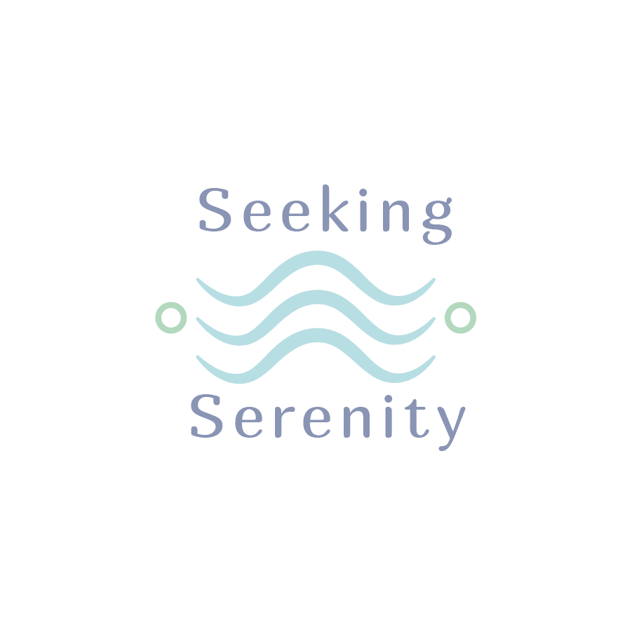
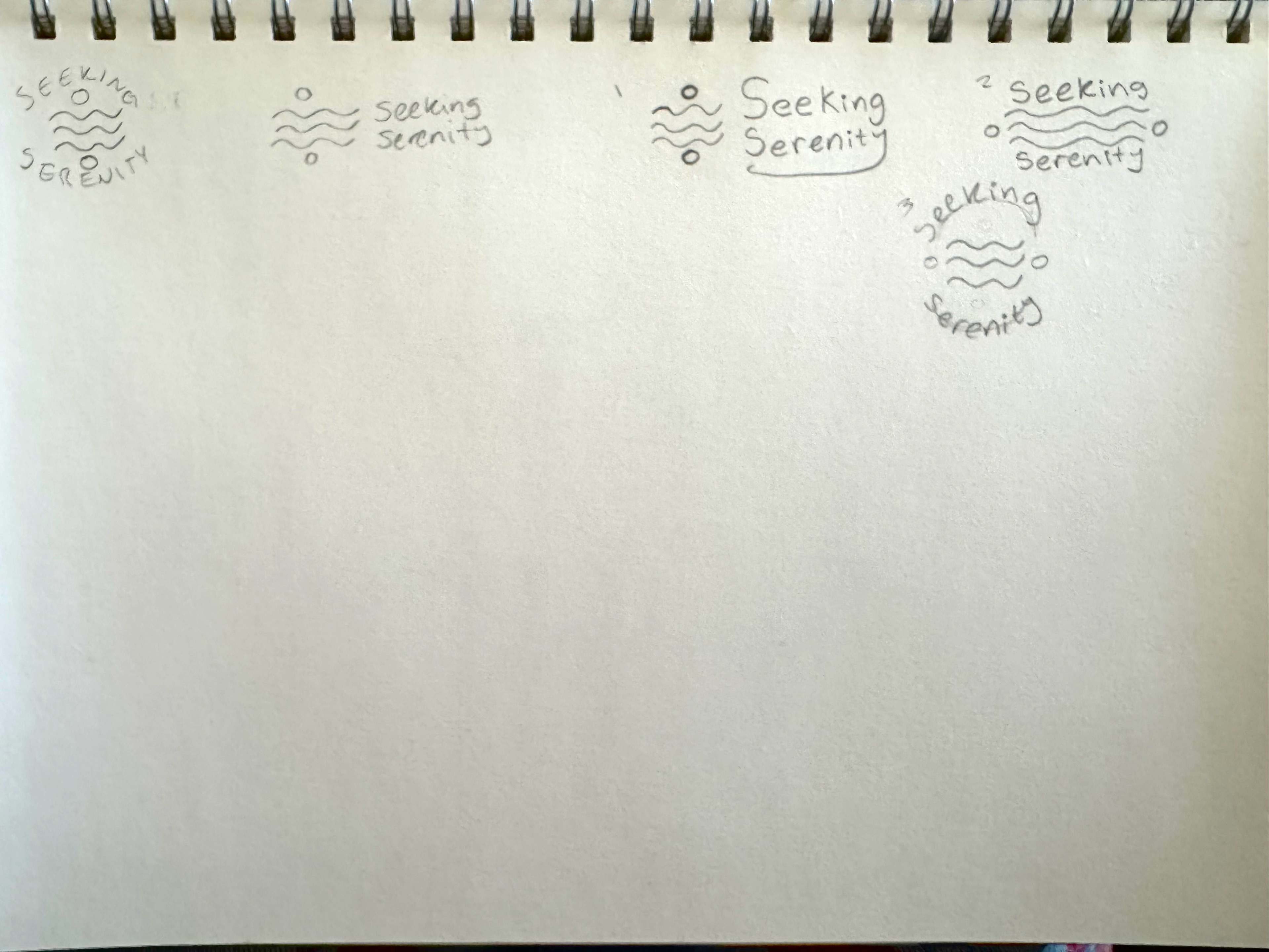
The initial logo concept successfully aligned with the client’s objectives. The circular elements symbolized balance—a key outcome the e-course aims to help participants achieve—while the wavy lines conveyed a sense of peace and fluidity, reflecting the ability to adapt gracefully to life’s challenges. They also subtly referenced the calming presence of water. However, the lines appeared too dynamic, evoking the feeling of turbulent waters rather than the serene stillness of a placid lake. After discussing the design with the client and gathering feedback on what resonated and what could be refined, I moved forward with a thoughtful revision.

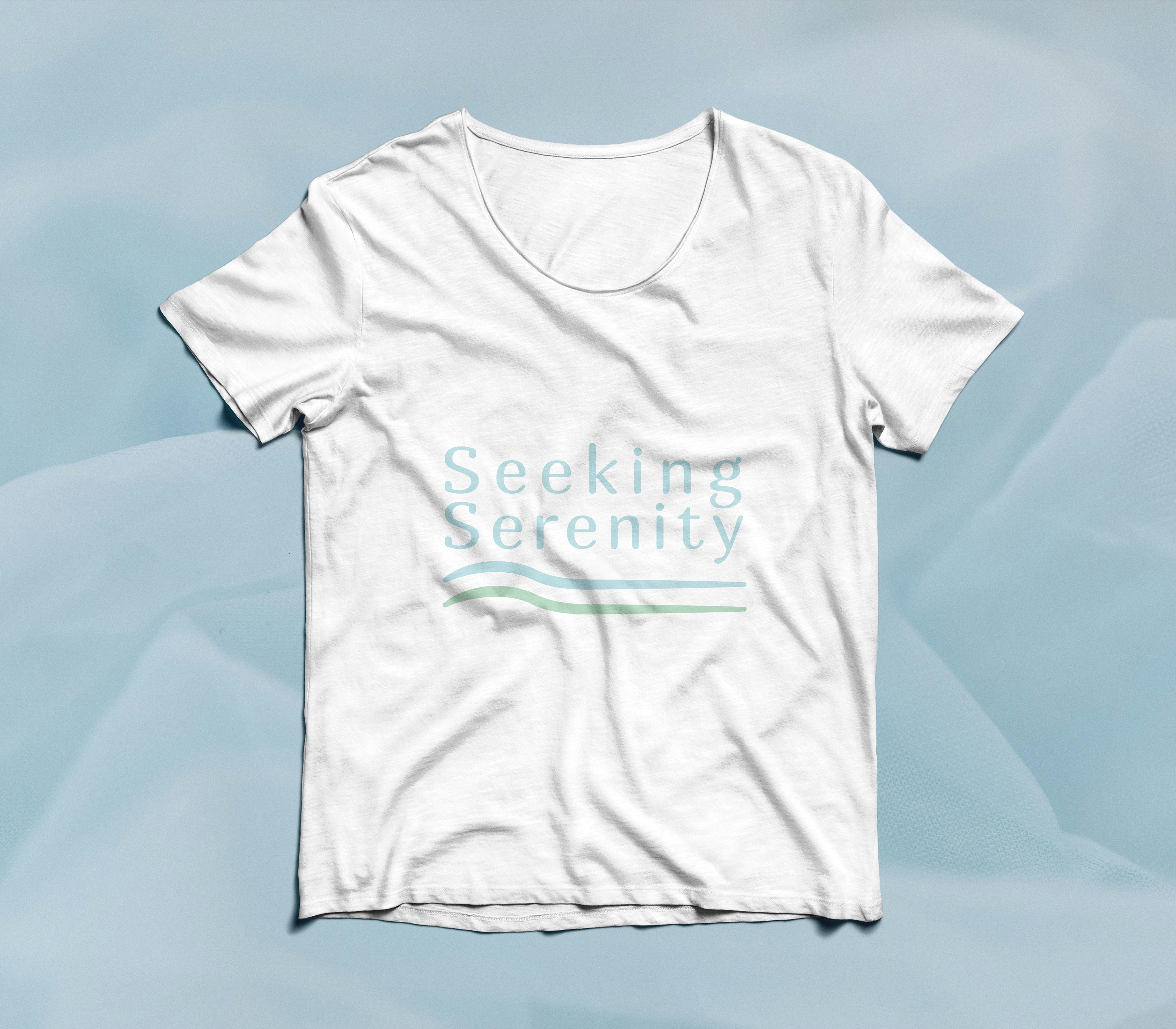
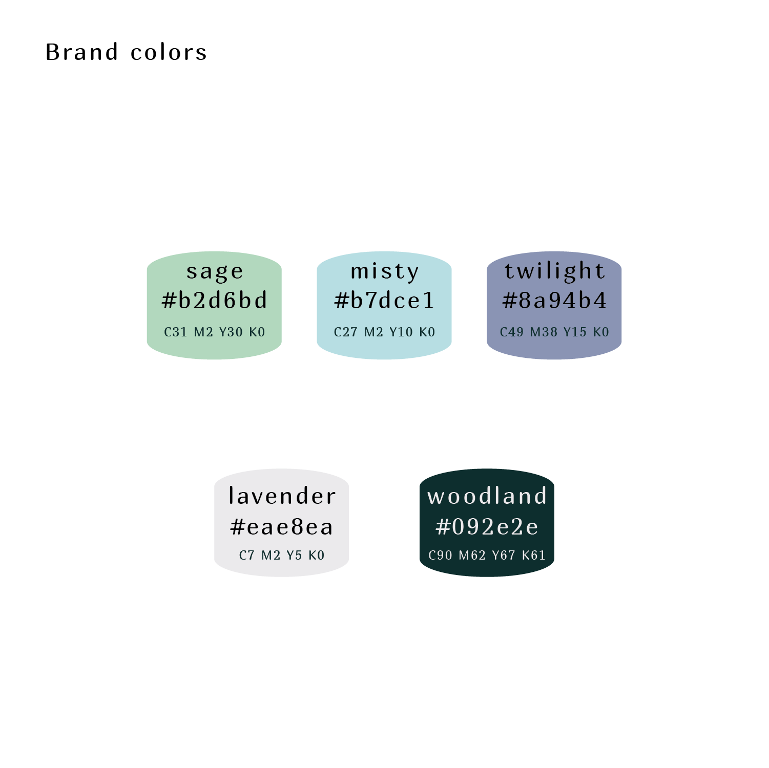
For the revised logo, we simplified the design by removing the circular elements, which had begun to feel visually cluttered. We also eliminated the third wave line and softened the remaining waves to evoke a gentler, more serene movement—reminiscent of water calmly lapping against the shore. The color palette was refined to enhance the overall sense of elegance and clarity. Every element, from the curves of the waves to the rounded typography, was intentionally chosen to convey the calm, centered feeling users can expect upon completing the e-course.

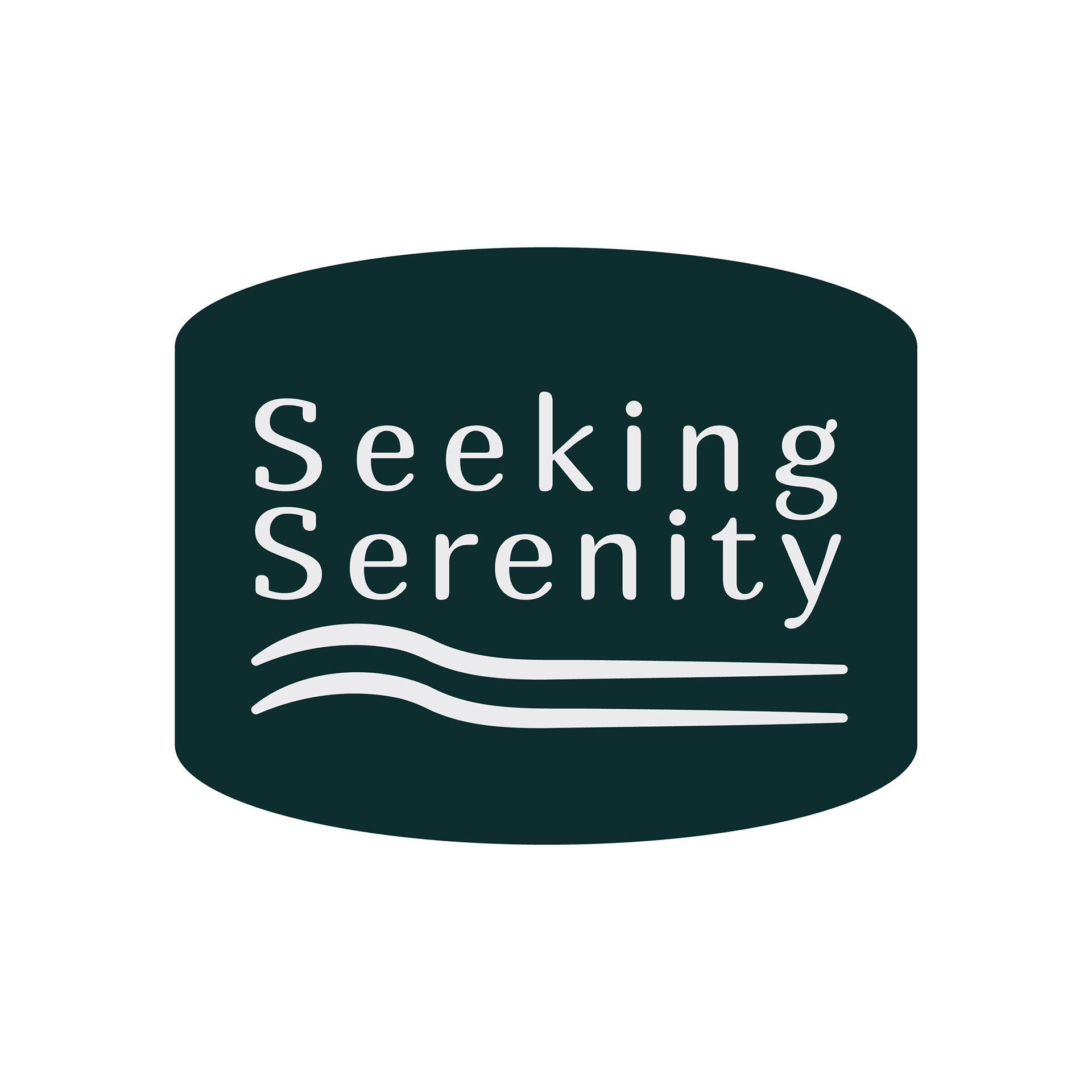
I designed a soft shape for the logo to be placed in for versatility. Logos are used in a variety of ways and the light colors in the original logo may not lend itself to all applications.