My personal brand needed a refresh. Although the previous design was well-executed, I felt it no longer represented me. I wanted to create something more authentic to myself that illustrated my style and design aesthetic while being approachable, professional, and creative.
Art Nouveau is my favorite art style so I looked to the artist best known for this style, Alphonse Mucha. His artwork combines floral and organic elements with elegant framework in his illustrations.
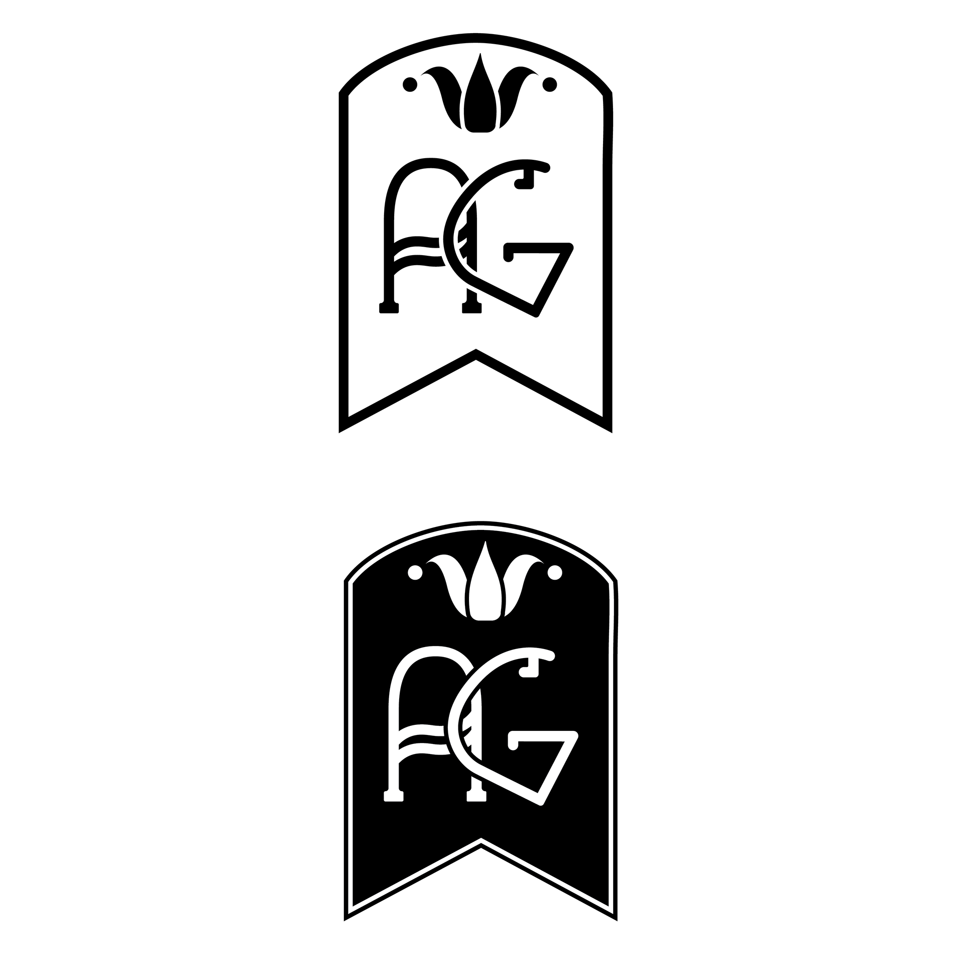
At first, I tried to find a font that fit the vision in my mind but quickly found none of them matched the look I wanted to achieve. The letters are hand drawn, which creates a more inviting and organic feel to the design. The frame around the logo is simple yet adds elegance and sophistication to the overall appearance.
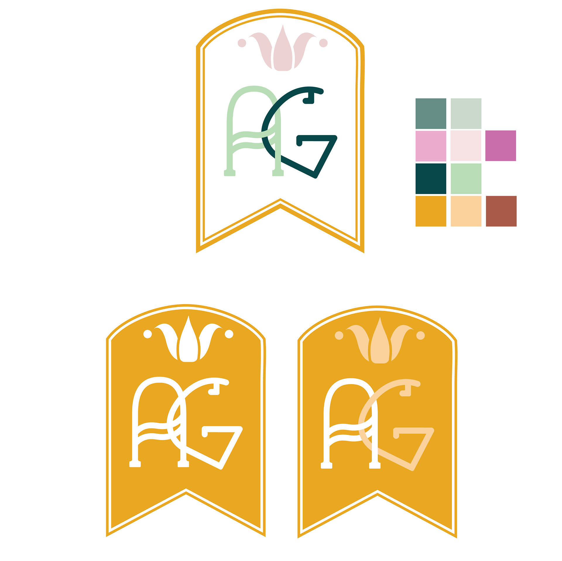
The colors are a mixture of saturated and muted selections to create contrast but also to maintain harmony and evoke a balanced, visually appealing composition. My brand should elicit feelings of trustworthiness, creativity, and originality.

The font Limelight is simple yet the combination of thin and thick lines lend itself to an Art Nouveau style. Avenir Medium as the secondary typeface contrasts well with the more decorative font.
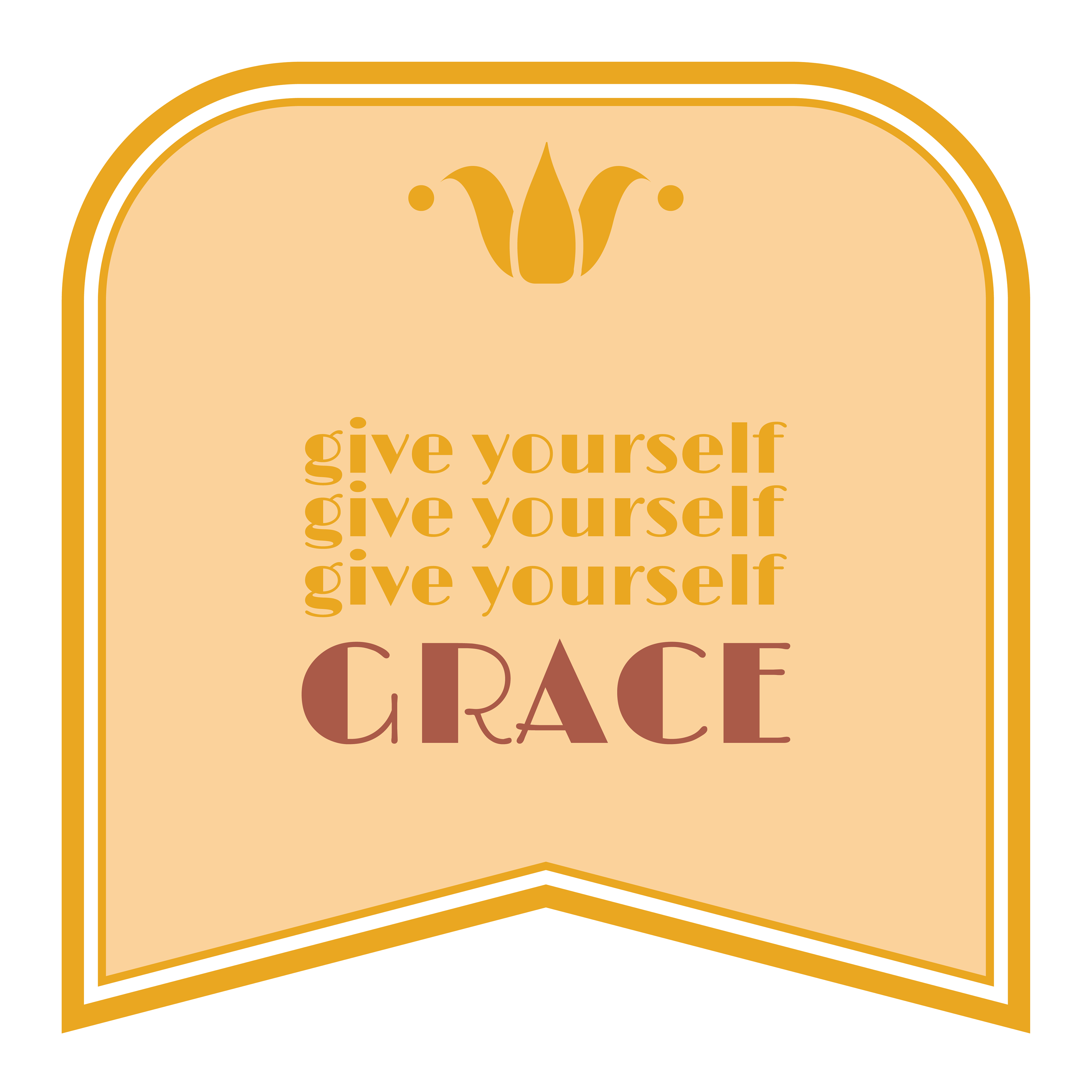
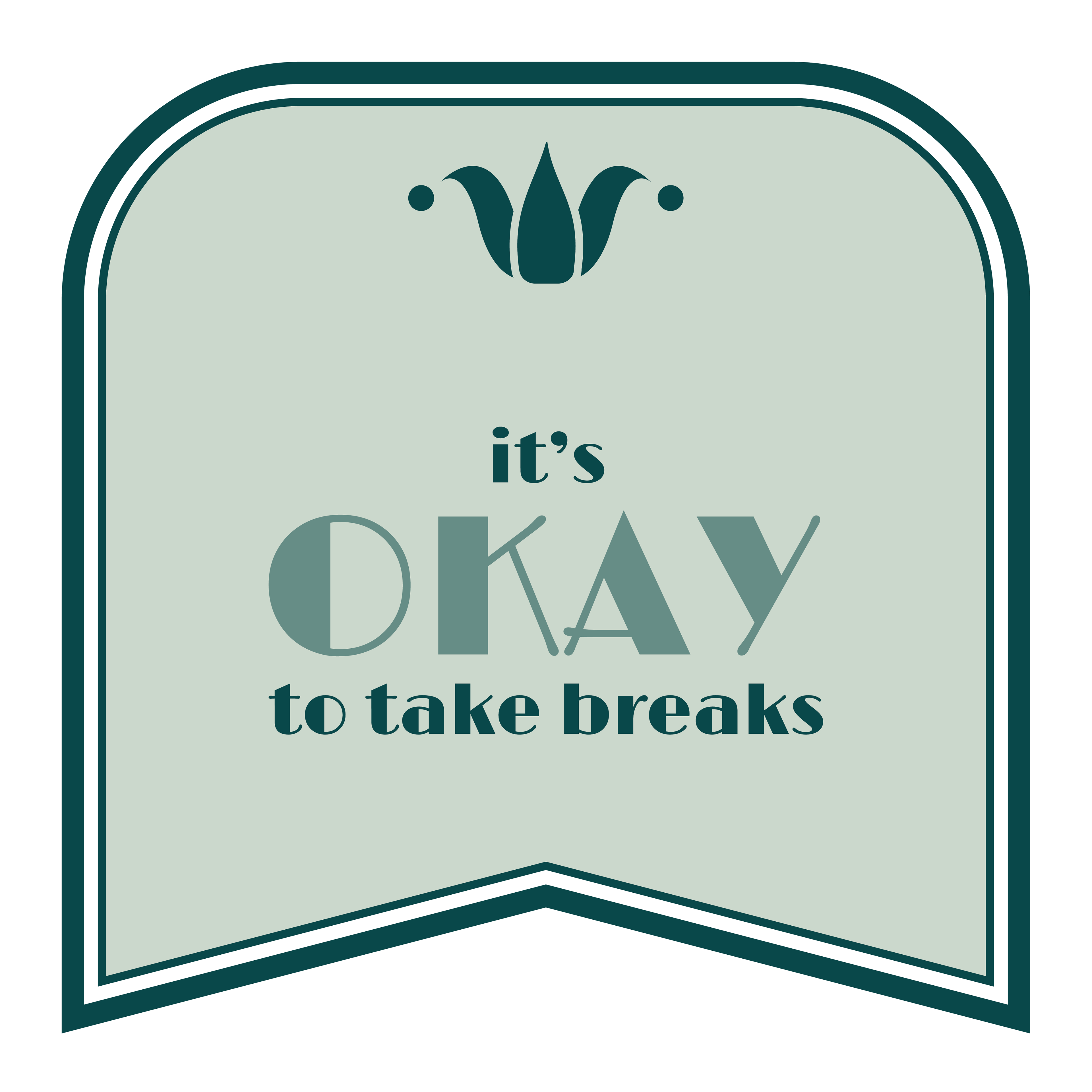
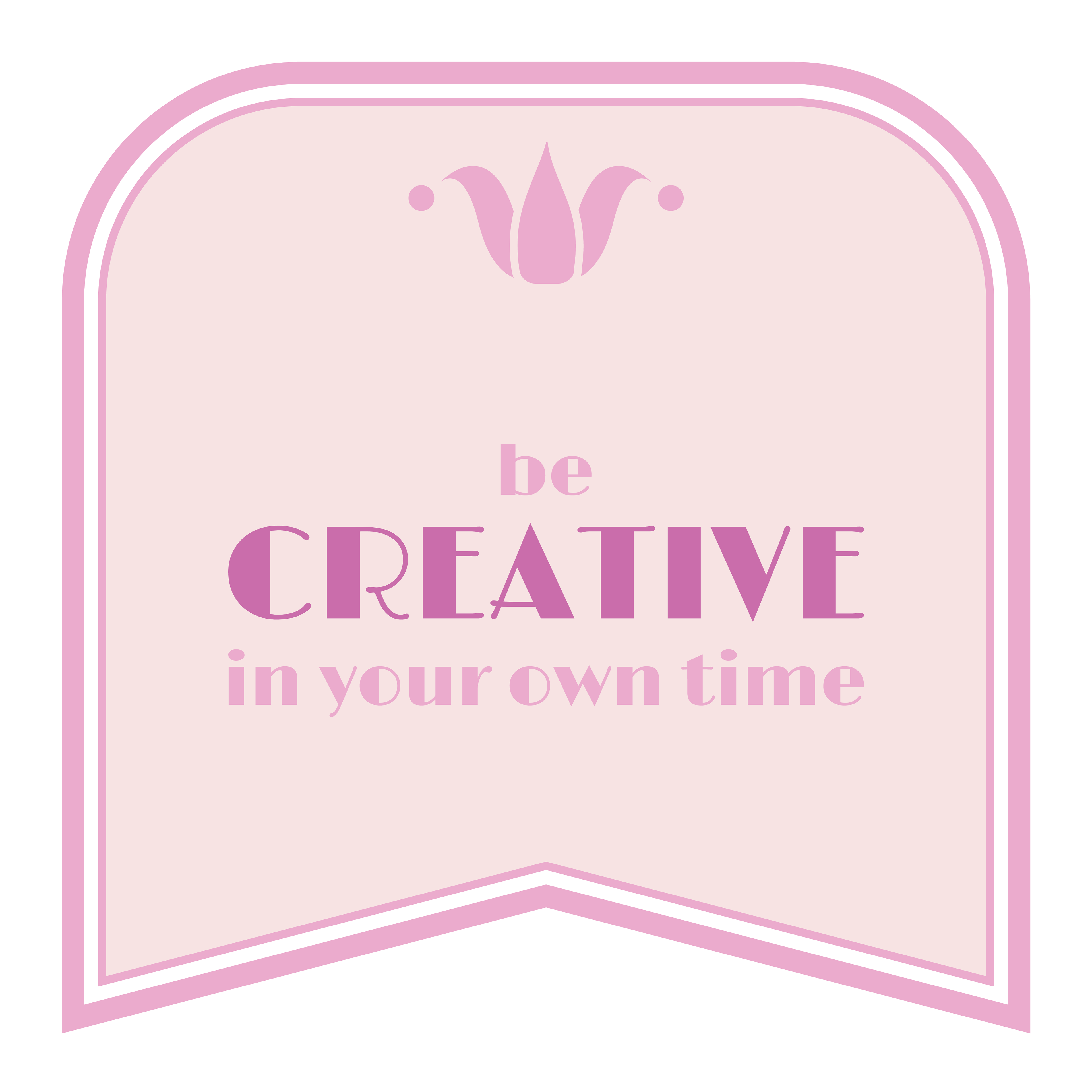


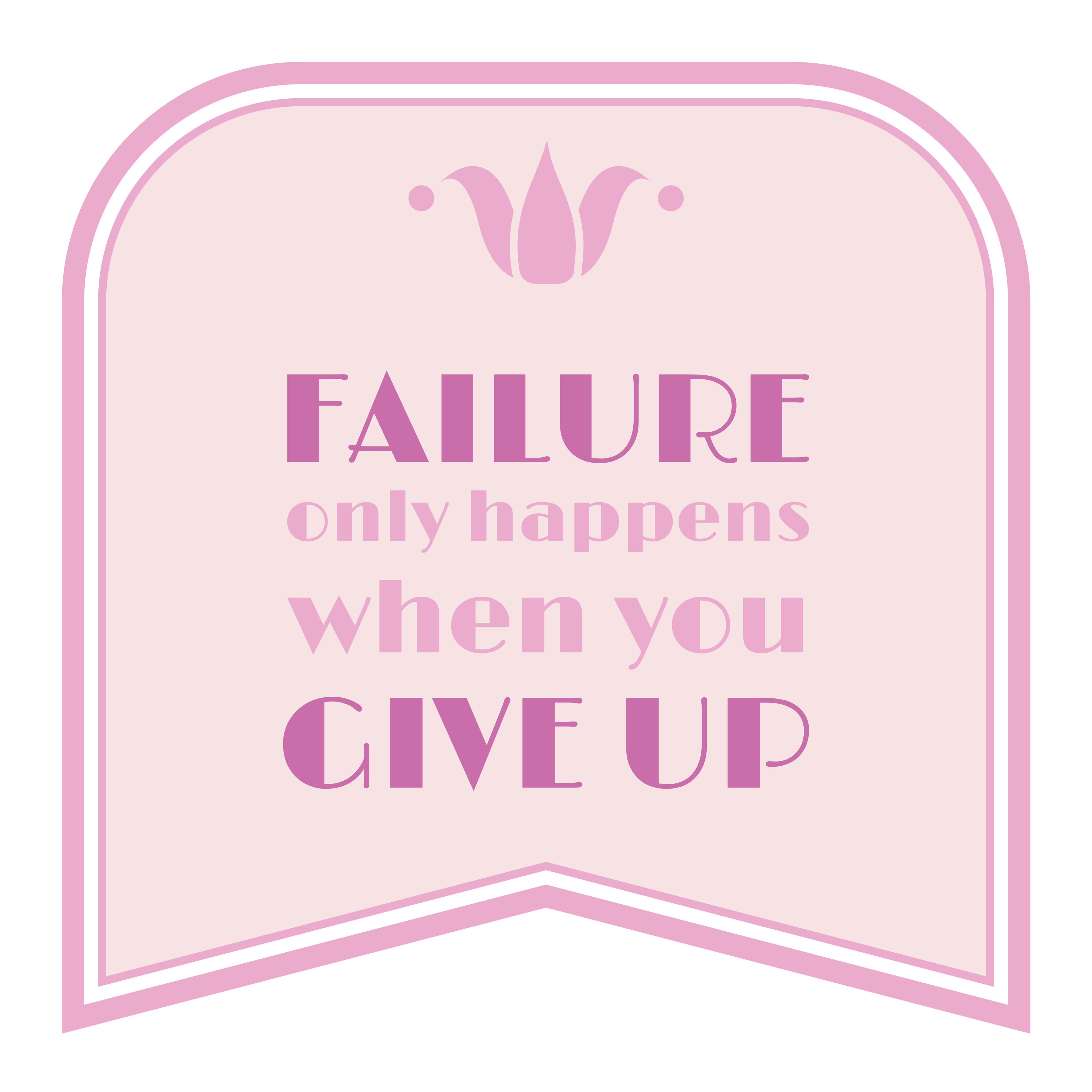
My brand should be friendly, empowering, and approachable. I launched a personal manifesto to go along with my brand redesign which I've posted to Instagram. I'd like to be known as a brand that uplifts those around me and provides encouragement.
