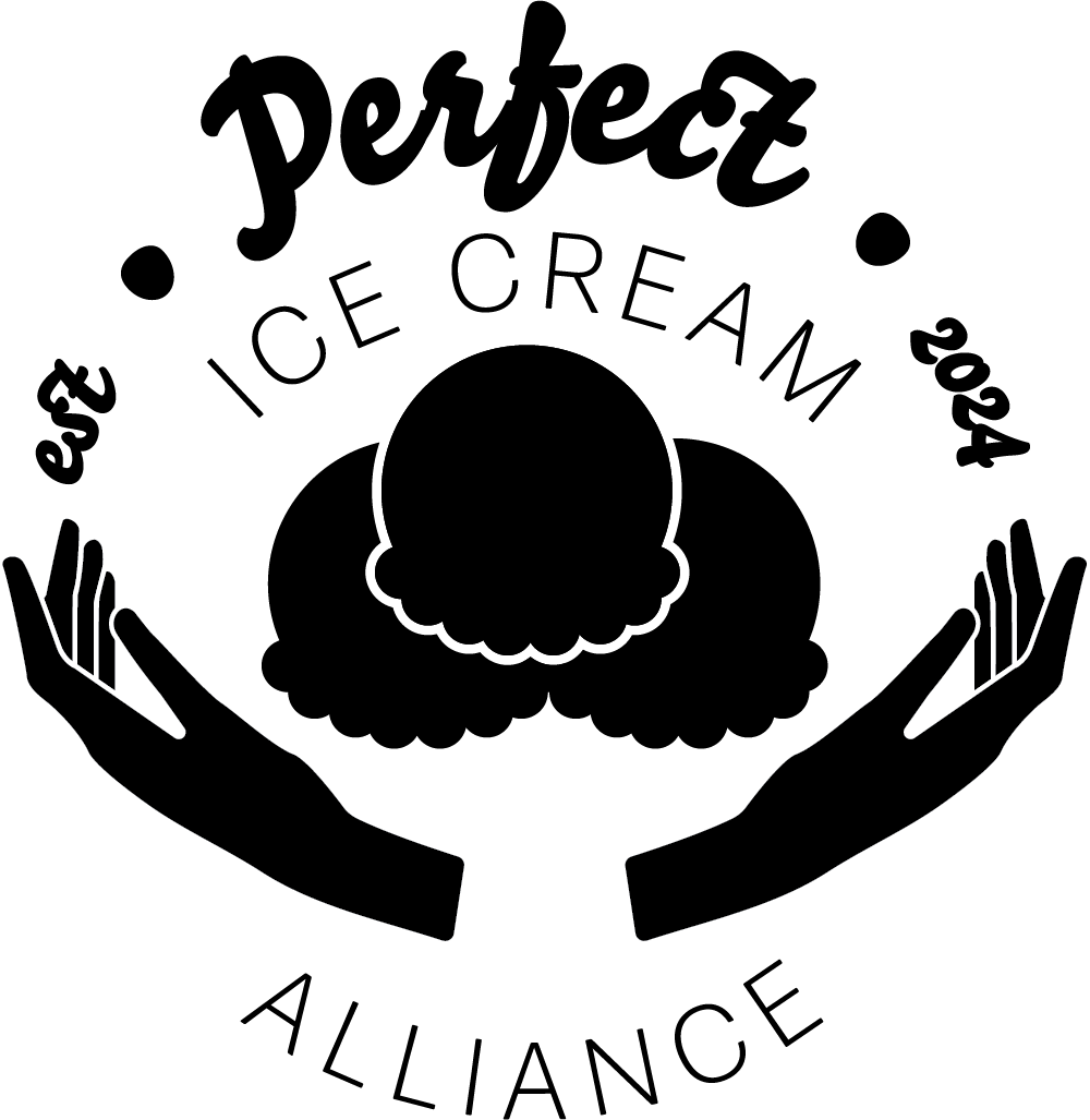
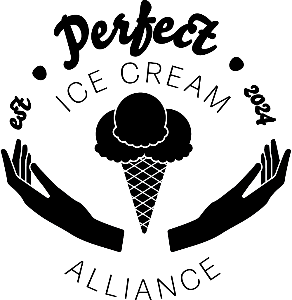
Perfect Alliance Ice Cream was conceived as part of a Skillshare course aimed at refining my logo design skills. The company name was generated randomly, and I undertook the responsibility of creating the logo for this new venture. My objective was to ensure the brand conveyed a sense of perfection while remaining approachable and playful. Below, you will find several iterations of the logo, showcasing my exploration of various shapes, layouts, and fonts.
Feedback plays a crucial role in the design process. After presenting my design to several colleagues, they suggested that the ice cream scoops did not clearly convey the concept of ice cream. To address this, I incorporated a cone into the design to enhance the recognizability of the ice cream scoops.


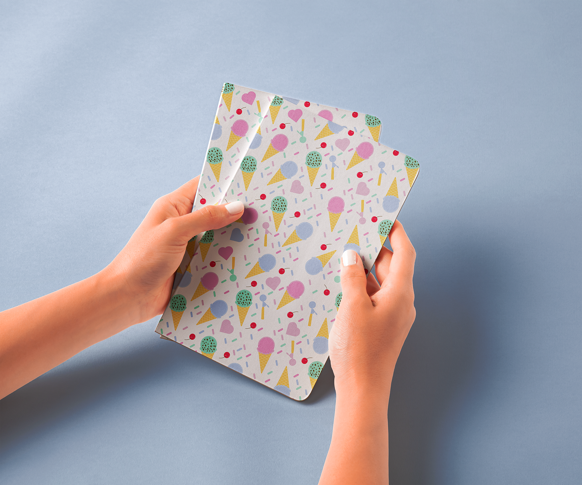
To achieve a playful and approachable tone in the logo, I utilized bright colors that effectively evoke a sense of fun and friendliness.


