
During Spring Break, my family and I visited friends in Portland, OR. While exploring the coast, we decided to enjoy some seafood and were recommended Bag O’ Crab for dinner. The food was fantastic, and the staff was friendly and attentive, making for a great dining experience.
However, as a designer, I couldn’t help but notice the logo—and not in a positive way. While I appreciated the playful concept of the crab, the addition of wings felt out of place and stylistically inconsistent. It appeared as though two unrelated images had been merged without cohesion. The design didn’t align with the quality of the restaurant, which inspired me to reimagine it.

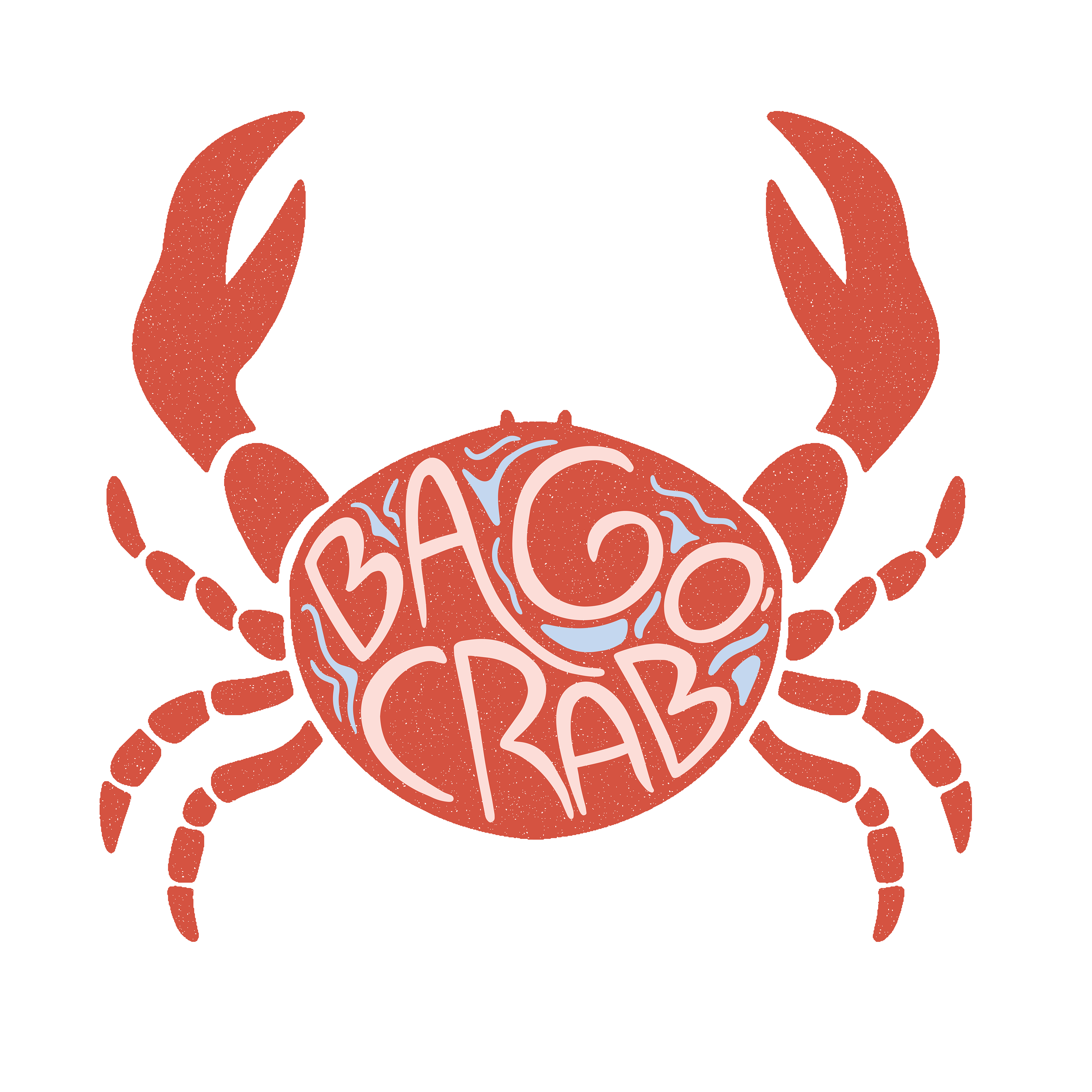
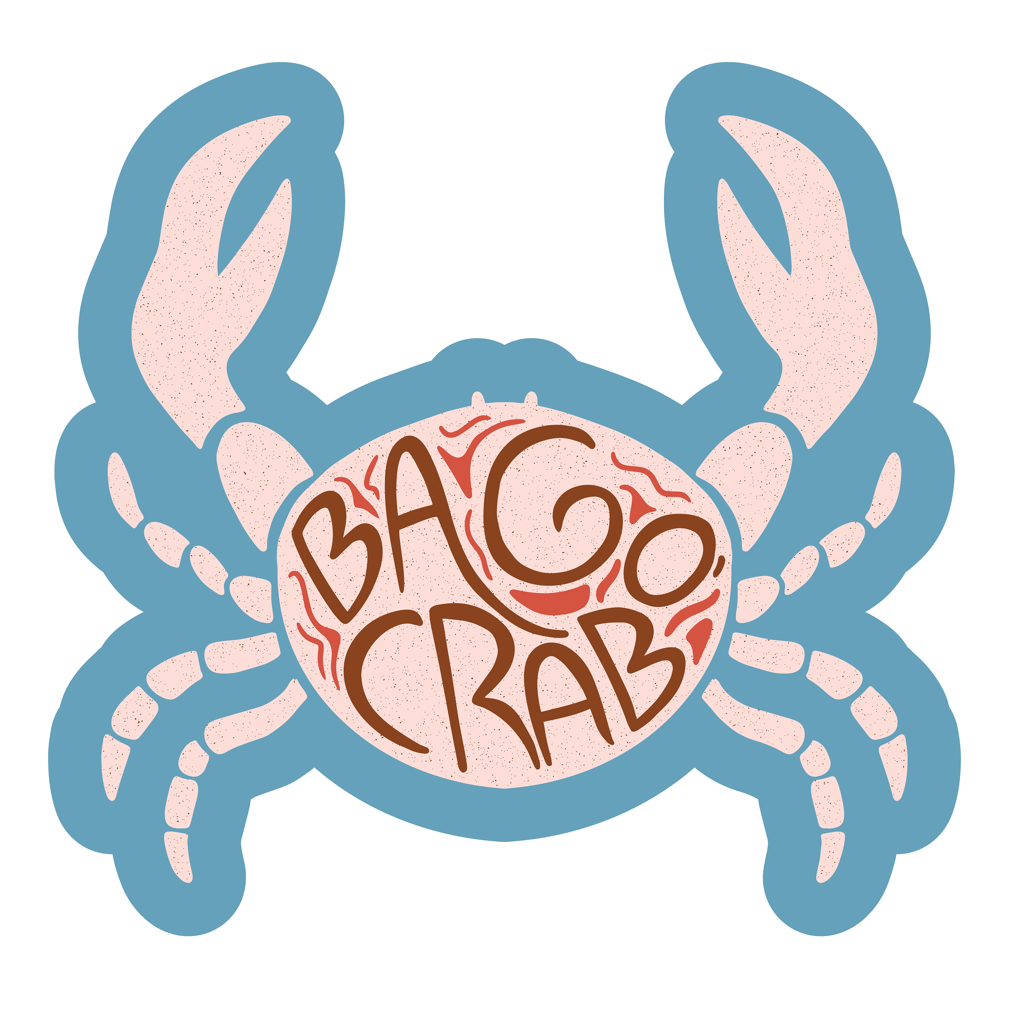
I wanted to retain the crab as the central element, since it’s a key focus of the restaurant’s identity, but the design needed a touch of sophistication. After exploring several iterations, I landed on a stylized, stenciled version of a crab, incorporating custom hand-lettering of the restaurant name directly within the form to create a cohesive and visually engaging logo.
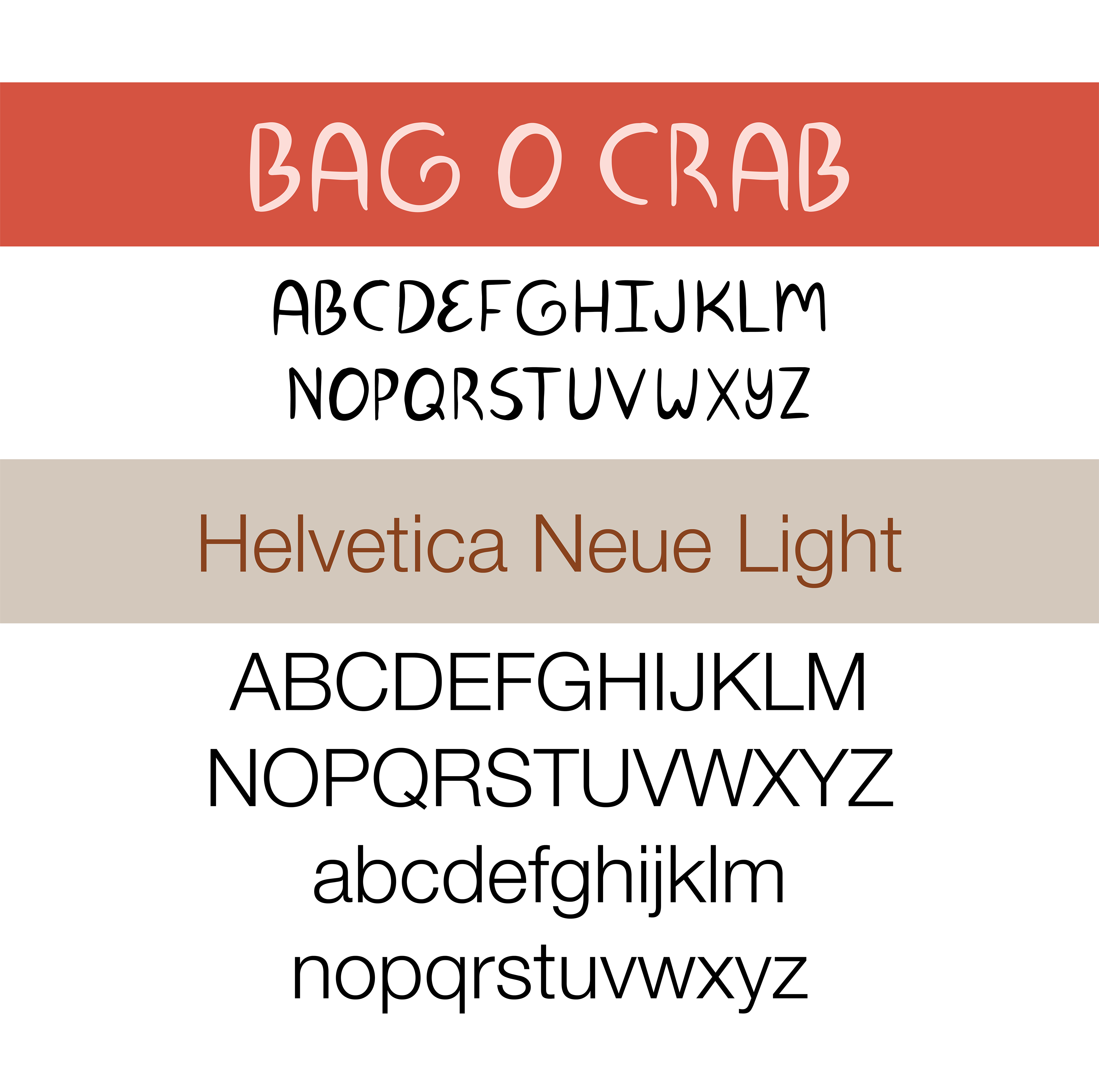
After some searching, I couldn't find a font that I liked to go along with the new logo. I took a Skillshare class and learned how to create my own font to match the logo.

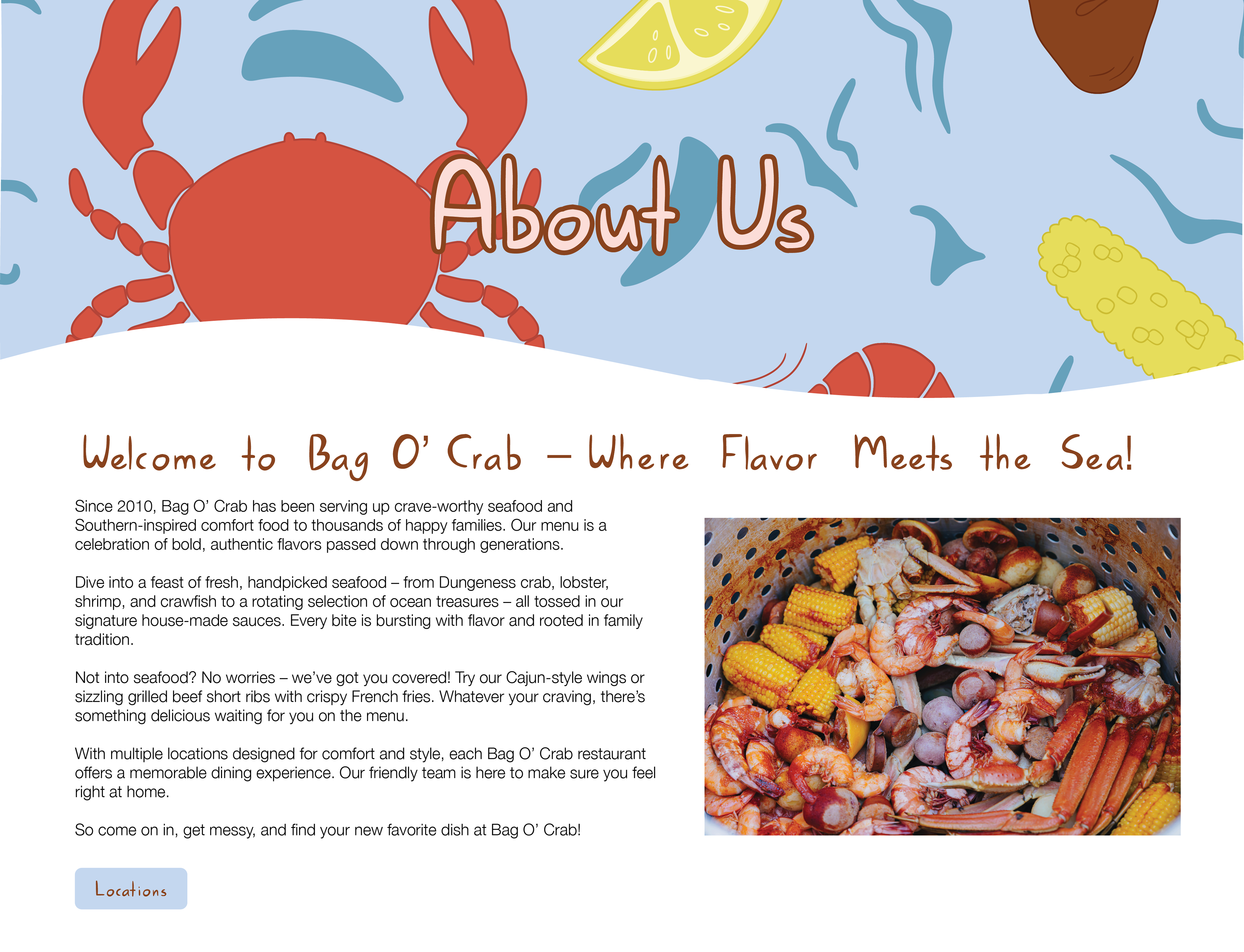

I also designed a seamless pattern that could be used in a variety of ways for merchandise and advertising.
